Your Cart is Empty


8 Bullet Journaling Fonts You Have to Try (For Every Level)
Whether you are a total beginner or already an avid bullet journaler, finding the right bullet journaling fonts can feel like a huge mountain to climb. With so many different options out there, we are spoilt for choice.
When you find the right fonts, your bullet journal becomes your own. Its aesthetics start to fit with your personal style, turning it into a space that inspires you to create, ideate, and share. Even if you are not the greatest artist, creating a polished font is an easy way to improve your journal without mastering custom illustrations.
We all know how much our physical environment can influence our mental health. Finding the right bullet journaling fonts can motivate you to journal more, and see even more positive results from your practice.
Bullet journaling font styles
Traditional journals tend to use one of three font types: serif, sans serif, and cursive. These come pre-printed into your journal, leaving you with limited space to explore your own style.
Bullet journaling fonts are different. Their possibilities stretch far beyond pre-printed styles, giving you full creative freedom to discover your own look. From modern minimal to bold cursive, we prefer to look at BuJo fonts through the lens of the aesthetic they create rather than the category they fall into. These are some of our favourites.
How to get started with BuJo fonts
If you are new to BuJo fonts, it can feel a bit intimidating, especially if you do not think you are the creative type. (Spoiler: we have all got an inner creative. Sometimes they are just a little harder to find.)
Rest assured, there are a few simple steps you can take to make experimenting with new fonts that little bit easier.
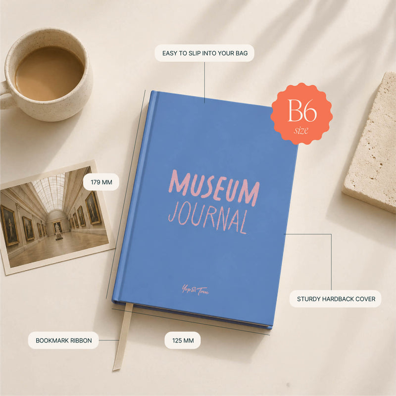
Firstly, choose a notebook with pages you enjoy writing on. A lined notebook gives you a consistent baseline for letter height, or try a museum journal for dedicated practice pages at the back. Set aside blank test pages before you use a new font on an important spread. Because we all know how frustrating a pesky mistake can be.
Next, find some fonts to use as inspiration and keep them by your side for easy reference. If you can print them out, even better. You might even like to trace some of the trickier styles for practice.
New to the method itself? Read our guide to bullet journaling before you dive into lettering.
Bullet journal title fonts
If you really want to make your title stand out, these bullet journal title fonts are for you. They are perfect for emphasising key pages (like your goals for the month) or simply adding personality without too much time or effort.
The beauty of title fonts is that you can use your normal handwriting underneath. Your titles still look bold and creative, but you do not have to spend quite so long testing different styles.
#1 Faux calligraphy
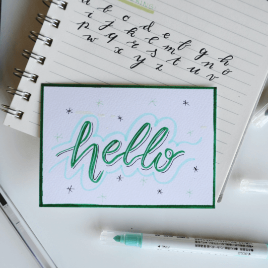
Faux calligraphy is one of the most popular bullet journal fonts, and for good reason. It gives you the aesthetic of calligraphy without mastering the art of the practice. Rather than writing in calligraphy, you write in a normal cursive font before going back to add the thick downward strokes that create the calligraphy style we all know and love.
#2 Block letters
If you are new to BuJo fonts, you will love block letter fonts. Simply write your letters as empty blocks, using your notebook lines as a guide, before going back to colour in each block. You do not have to use the same colour throughout each word. Get creative with different pens or paints to find your own style.
#3 Banner fonts
Banner fonts were made to be bullet journal titles. Simple and fun to create, a banner font is any font presented in a banner style. Draw a curved or straight ribbon behind your word, write the letters on top, and add small folds at the edges for extra charm.
#4 Doodle fonts
If you are already finding yourself doodling little illustrations, then a doodle font is the font for your bullet journal. Try merging your doodles into your letters, or joining multiple doodles together to form the shape of a letter. It takes some time, but the result is worth it.
#5 3D fonts
If there is one magic ingredient that is bound to make your page stand out, it is texture. And 3D fonts do just that. They are not quite as scary to create as you might think. Simply write your word on the page, then go back to add a shadow below and to one side. Voilà, you have got a brand new journaling font.
#6 Layered fonts
Layered fonts are taking over social media right now, and we are here for it. These colourful bullet journal fonts are perfect for titles, as the background block font sets the scene for the (typically) darker cursive font layered on top. Write a bold block word first, then overlay a finer script in a contrasting colour.
Even more fonts for journaling
Sometimes, you are looking for a more subtle bullet journaling font. That is exactly what these styles are for, with a more minimal look that suits the modern aesthetic.
#7 Cursive
If bold calligraphy feels a bit too much for you, a simple cursive font is a great alternative. Best explored with a fineliner pen, cursive is ideal for breaking up your bullet journal spreads in a slightly more subtle way. Keep the lettering clear and simple so any illustrations on the page still take centre stage.
#8 Modern minimal
Sometimes, simplicity is best. Modern minimal fonts prove that theory. These bullet journaling fonts are easy for beginners but should not be forgotten by more advanced journalers either. Their clean sans serif style makes them easy to read whilst adding a fresh, uncluttered feeling to your spread.
Which font will you try first?
Which bullet journaling font will you choose? Or will you mix and match to create your own style? Pick one title font to practise this week, use your test pages generously, and build from there.
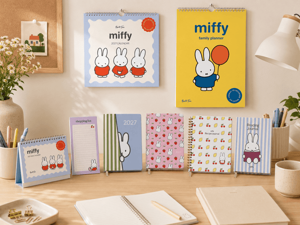
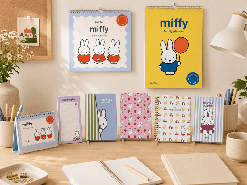
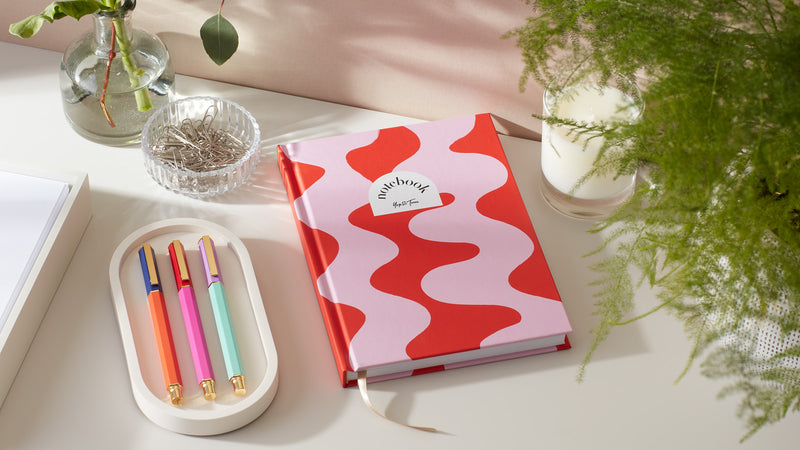
A notebook you love makes all the difference. Browse our lined notebooks and Luxe Pattern notebooks to find a cover that inspires you to open the page.
