











Have you noticed how your eyes naturally gravitate towards certain colours when you walk into a stationery shop? How some colours feel more "you", while others feel like an unnatural fit?
Some of that comes down to personal preference. But a big part of it is colour psychology. Ever since Isaac Newton first refracted white light into each colour of the rainbow, humans have been fascinated by colours and the impact they can have on our wellbeing, mood, and psychology.
What is colour psychology?
Colour psychology is the theory that different colours can have different impacts on our behaviour and emotions. Whilst one colour might bring calm and serenity, another might trigger angst and frustration.
It is the study of why this happens, with colours grouped together to correspond with different emotive states. The branding and marketing industry uses colour psychology to transform how consumers view different companies, even changing the colour of website buttons to encourage more people to make a purchase.
Why should you care about colour psychology when choosing your stationery?
We all know that great design can impact how we feel when using a product. If something works well for us, feels luxurious, and perfectly serves our needs, we are far more likely to use it on a regular basis. Meaning all those benefits from journaling, goal setting, and organisation are far more likely to make their way into your life.
Colour psychology takes that one step further. How do you want to feel when you are using your journal, notebook, or planner? Calm? Energised? Inspired? Relaxed? Focused? Whatever it is, the colour of your stationery can help you achieve that.
But what about colour therapy?
Interior designers will often use colour therapy to bring different tones and emotions into our physical spaces. You have probably noticed that most hospital rooms are blue. Anecdotal evidence suggests that the colour blue can bring down your blood pressure and slow your heart rate. So if hospitals are paying attention, we think we should be too.
You have your own colour psychology
We are about to dive into the theory behind colour psychology. But before we do, remember this: you have your own colour psychology. You have your own past, your own history, your own life story. And all of these influence how you feel around certain colours.
Some might trigger a sense of nostalgia whilst others will bring up old memories and emotions. Whilst colour psychology can be used as a general guide, remember to bring your own history into play too. Only you can truly know how each colour makes you feel.
The basics of colour psychology

Red
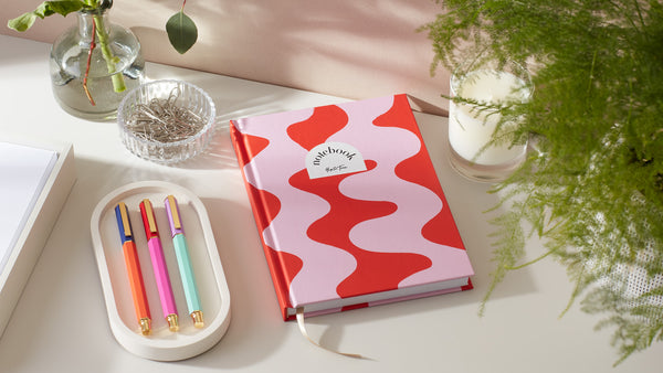
Red is a bold colour, typically associated with feelings of passion and excitement. It is known to symbolise strength, confidence, and power. Given its link with fire, it can also represent heat and warmth. If you are looking for a bold confidence boost with your stationery, then red is the colour for you.
Our pick: Red Ripple lined notebook from the Graphic Range.
Pink
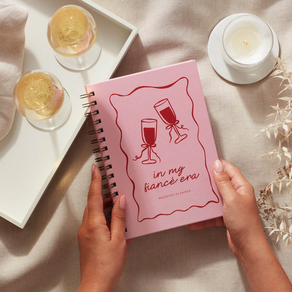
Pink can be linked with different emotions depending on the shade used. A paler pastel pink is considered soft, feminine, and youthful. A vibrant bolder pink creates a sense of energy, fun, and playfulness. If you need an extra energy boost from your stationery, then pink is the colour for you.
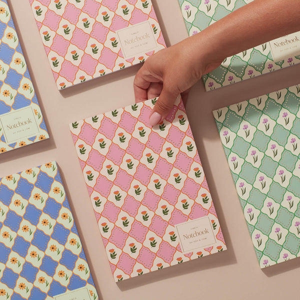
Our pick: Pink Flowers Luxe Pattern notebook or the Pink Stripes wellness journal.

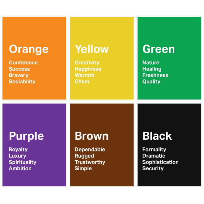
Orange
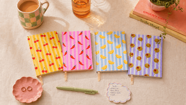
Orange is a confident colour. It speaks of bravery and fresh activity. It naturally creates a sense of warmth and optimism, hinting at a brighter future. Orange can also help with a feeling of possibility, freedom, and positivity. If you are craving more optimism from your stationery as you move towards your goals, then orange is the colour for you.
Our pick: Browse the Pantry Stripe collection for warm, food-inspired covers with cheerful illustrated colour.
Blue
Blue is a very reliable colour. It has been used by the military, big businesses, and even royalty for centuries. Because of this, it creates a sense of strength, reliability, and consistency. At the same time, blue can also build feelings of peace and calm. If you need to remind yourself of how strong you are whilst adding a sense of calm into your stationery, then blue is the colour for you.
Our pick: Blue Shells Luxe Pattern notebook or the Blue Shells travel journal.

Purple
Purple has long been the colour of royalty. But it also symbolises creativity, spirituality, and escapism. It is a positive colour that can feel a little whimsical at times, depending on the shade used. Its link with wealth can also help to create feelings of abundance. If you need a little extra creativity from your stationery, then purple is the colour for you.
Our pick: Lilac Flowers Luxe Pattern notebook.
Green
Green is a very natural colour, given its association with nature and the environment. Because of this, green can indicate growth, renewal, and depth. It helps to build a refreshing, calming feeling. If you are looking for some gentle encouragement to grow from your stationery, then green is the colour for you.
Our pick: Green Flowers Luxe Pattern notebook or a Garden planner if you want structure around outdoor projects.

Colour psychology through the seasons
In the 1970s and 80s, Angela Wright dove further into the theory of colour psychology, linking patterns of colour with patterns of behaviour. Part of her research involved assigning each colour group a season that represents its personality.
Spring
The Brand Stylist, Fiona Humberstone, links each season with different brand personalities, and we believe they can be applied to individuals too. The spring personality is creative, inspirational, and full of life, linked with light, bright colours that still have a softness.
Our spring stationery pick: the Pink Flowers Luxe Pattern notebook.
Summer
Fiona describes the summer personality as more reserved, graceful, and organised, with a strong sense of responsibility. Summer colours are cool and muted.
Our summer stationery pick: the Blue Shells Luxe Pattern notebook.
Autumn
Autumn is described as earthy and warm by Fiona, with a strong link to nature. Autumn colours are warm, intense, and muted.
Our autumn stationery pick: the Green Flowers Luxe Pattern notebook.
Winter
Fiona speaks about winter as a dramatic, opulent, and luxurious season. Its personality can cover both big-picture thinking and detailed focus. Winter colours are bright, intense, and cool.
Our winter stationery pick: the Blue Flowers Luxe Pattern notebook.
Which season matches your personality? The colours you choose may well change throughout your life (and even your year) depending on your needs at the time. So let them evolve and see what you discover.
Browse by collection
Explore our Luxe Pattern notebooks for bold foil-detailed designs, the Graphic Range for bright botanical prints, or the Pantry Stripe collection for cheerful illustrated covers. Browse all notebooks and journals to compare formats.
